How to Select the Right Color Palette in Design
Are you starting an interior design project and trying to figure out the perfect color scheme? Whether you're working on your home, an office, or a commercial space, choosing the right colors is one of the most important steps in the process. With so many shades and combinations to choose from, it can be overwhelming to decide what works best. But don't worry—there are simple strategies that can help you create a beautiful and cohesive look without the stress. In this post, I’ll share some essential tips to make selecting a color palette easier and more enjoyable.

What is Color Theory?
Color theory is a fascinating area of study that explores how colors interact with each other and how they affect our emotions and perceptions. It involves understanding elements like hue, saturation, and brightness, and how these influence visual appeal. Colors have the power to evoke feelings, set moods, and even impact behavior. By learning the basics of color theory, you can make more intentional and effective design choices that bring your space to life.
Color Theory Basics for Interior Design
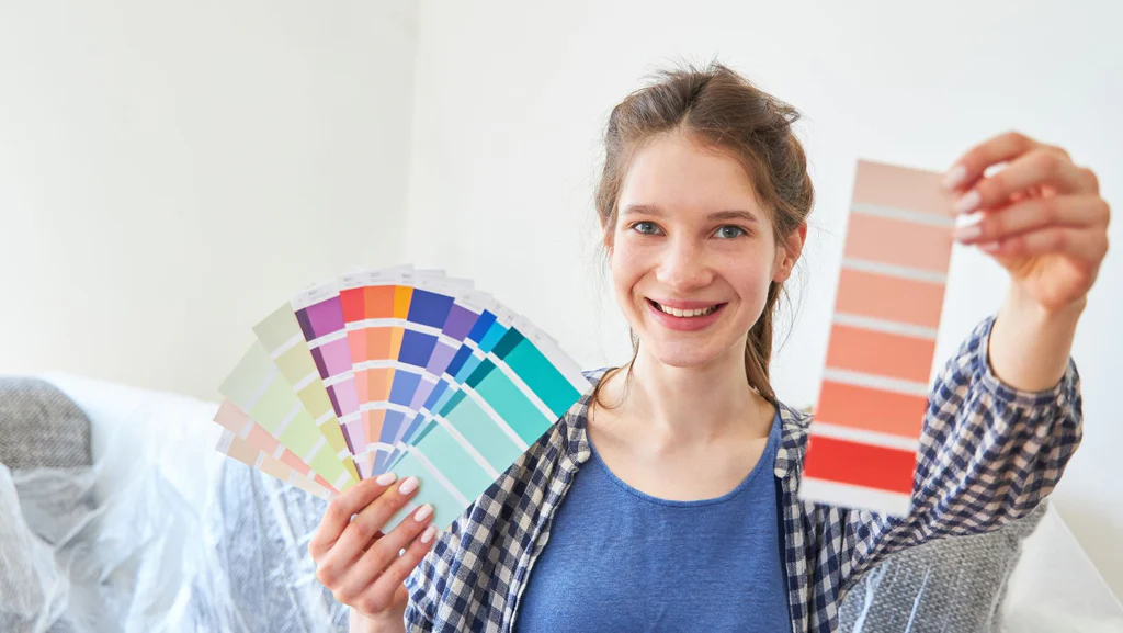
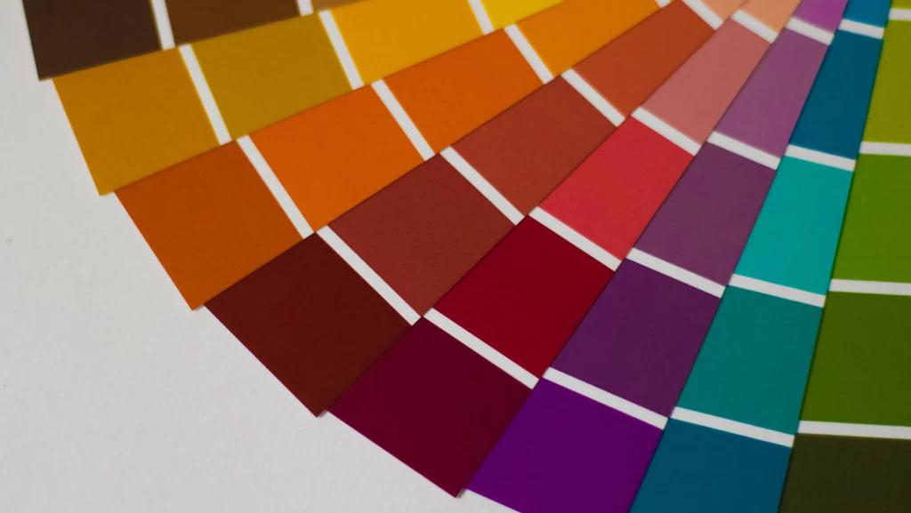
- The Color Wheel: The color wheel is a fundamental tool for designers. It includes 12 colors arranged in a circle: three primary (red, blue, yellow), three secondary (green, orange, purple), and six tertiary (like red-orange or blue-green). Understanding the relationships between these colors helps in creating balanced and appealing designs.
- Color Harmony: This refers to how different colors work together. There are several types of harmony, such as monochromatic (different tones of the same color), complementary (colors opposite on the wheel), analogous (adjacent colors), and triadic (three evenly spaced colors). Each offers a unique visual effect.
- Mood & Emotion: Colors can significantly influence the mood of a room. Warm tones like red, orange, and yellow can make a space feel cozy and energetic, while cool tones like blue and green create a calm and soothing environment. Bright colors add vibrancy, while muted shades offer elegance and sophistication.
- Lighting: The way light interacts with color can change its appearance. Natural light brings out true color, while artificial lighting can alter hues, making them appear warmer or cooler. Always test colors under different lighting conditions before finalizing your choice.
- Texture: Textures also play a role in how colors are perceived. Rough surfaces may give a more natural feel, while smooth ones look sleek and modern. Different textures can also affect how light reflects off a surface, changing the way a color looks throughout the day.

Tips for Using Color Theory in Interior Design
- Start by picking a color you love. This will serve as the foundation of your palette.
- Use the color wheel to find complementary or analogous colors that work well together.
- Try the "dark to light" approach: darker colors for floors, medium for walls, and lighter for ceilings. This creates depth and makes the space feel larger.
- Don’t shy away from neutrals like gray or beige—they provide balance and pair beautifully with bolder accents.
- Apply the "60-30-10" rule: 60% dominant color, 30% secondary, and 10% accent. This keeps things visually balanced and cohesive.
- Combine warm and cool tones for a dynamic yet harmonious look. For example, pairing soft grays with warm wood tones adds balance and comfort.
- Monochromatic schemes are great for small spaces. Use different shades of the same color to create interest without overwhelming the eye.

Choosing the right color palette can be challenging, but with a little knowledge and creativity, you can achieve a space that feels both stylish and functional. Don’t be afraid to experiment and trust your instincts. After all, your space should reflect your personality and taste. Keep it simple, stay inspired, and enjoy the process of transforming your space with color!
Pipe Epoxy Paint,Epoxy Paint Coating,Epoxy Resin Coating,Pipe And Fitting Epoxy Paint
Wuan City Kun Yu Metal Products Co.,Ltd , https://www.kunyucasting.com